01
Paint
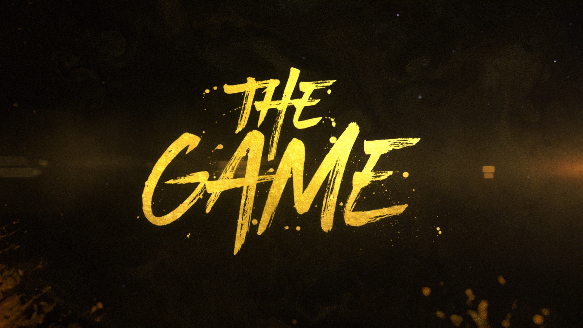
Raw gesture and hand-painted energy.
Paramount+ / The Game / 2021
Campaign Identity · Motion Design · Broadcast Open
Four visual routes led to a complete motion identity—one strong enough to cross from marketing into the series itself.
Paramount+ asked its creative team to develop promotional identities for the continuation of The Game. I pitched four routes exploring hand-painted energy, sports texture, arena polish and nighttime atmosphere.
Direction 04 was selected. I expanded it into a modular motion toolkit for trailers, social and on-platform assets. Then production adopted the identity as the show's episodic opening title.
01 / The pitch
Paint began with raw gesture. Pop pushed sports texture. Prime introduced arena light and space. Final balanced the authored gold mark with enough restraint to carry a complete campaign.
Raw gesture and hand-painted energy.
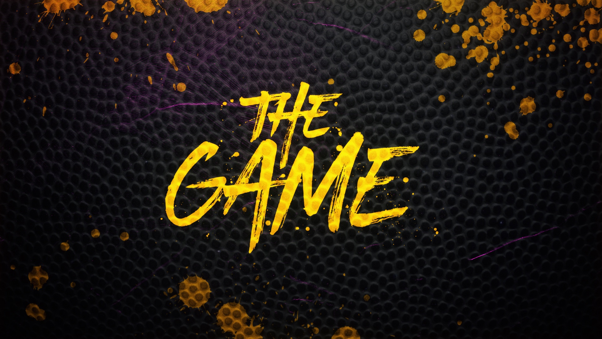
Sports texture pushed into graphic space.
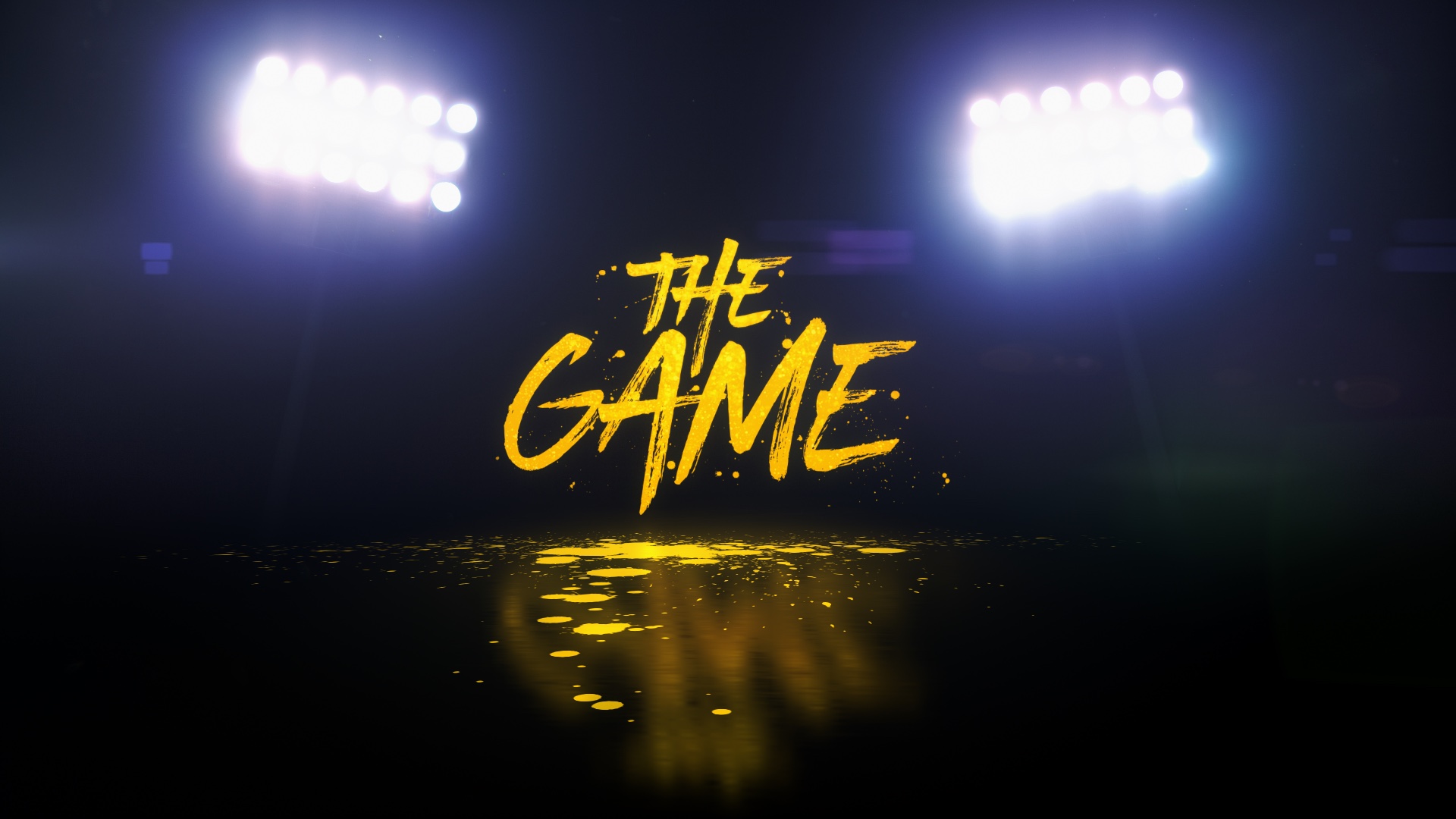
Arena light, polish and dimensional scale.
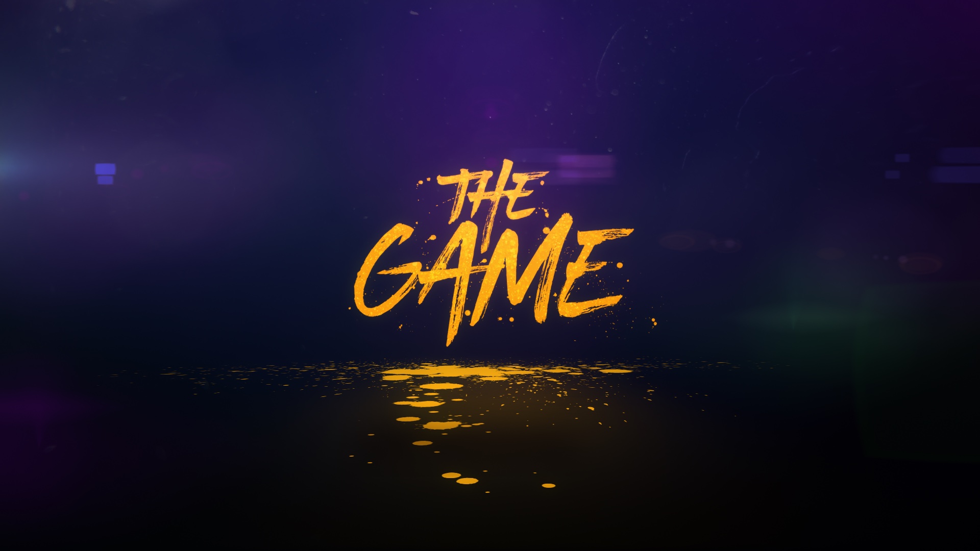
The authored gold mark, balanced for a complete campaign.
03 / The toolkit
16:9 archival toolkit shown
The payoff
Created for promos and trailers. Adopted as the show's episodic opening title.